Following on from our client meeting, we compiled a MoSCoW list of requirements. These are listed at our about page.
Human-computer interaction considerations
We then started to examine the human-computer interaction considerations for our users, including both users and administrators of the voice assistant.
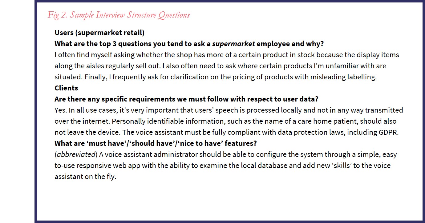
Gathering user requirements
In order to identify and then prioritise our user requirements, we interviewed both our clients as well as friends representing each of the primary use case environments: care homes, the NHS, retail and childcare settings. We chose to conduct recorded, semi-structured interviews as they offer us greater flexibility to encourage our interviewees to elaborate on crucial details as compared to alternative methods, such as online surveys.
We based our interviews on a unified team framework, interview template format and tools, allowing us to work more efficiently and effectively by sharing a consistent common language for collating and comparing our research findings. We intend to regularly perform user requirement sprints to continually clarify, validate and update our model of users’ needs.
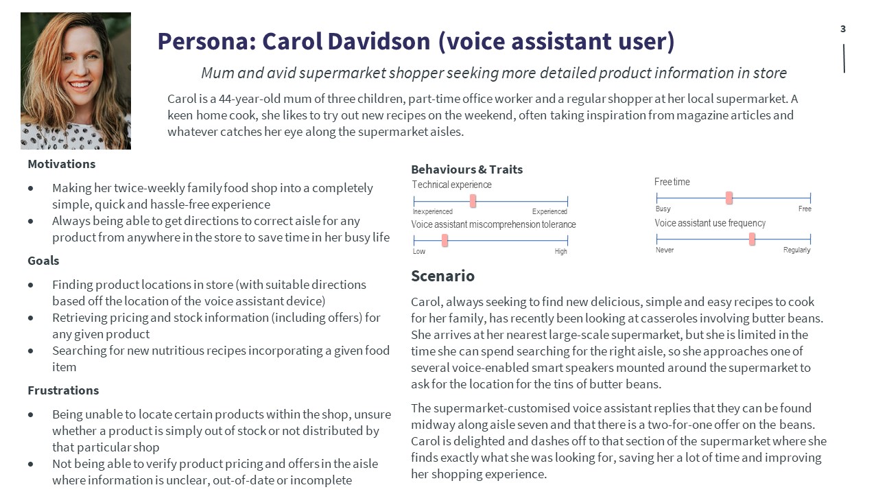
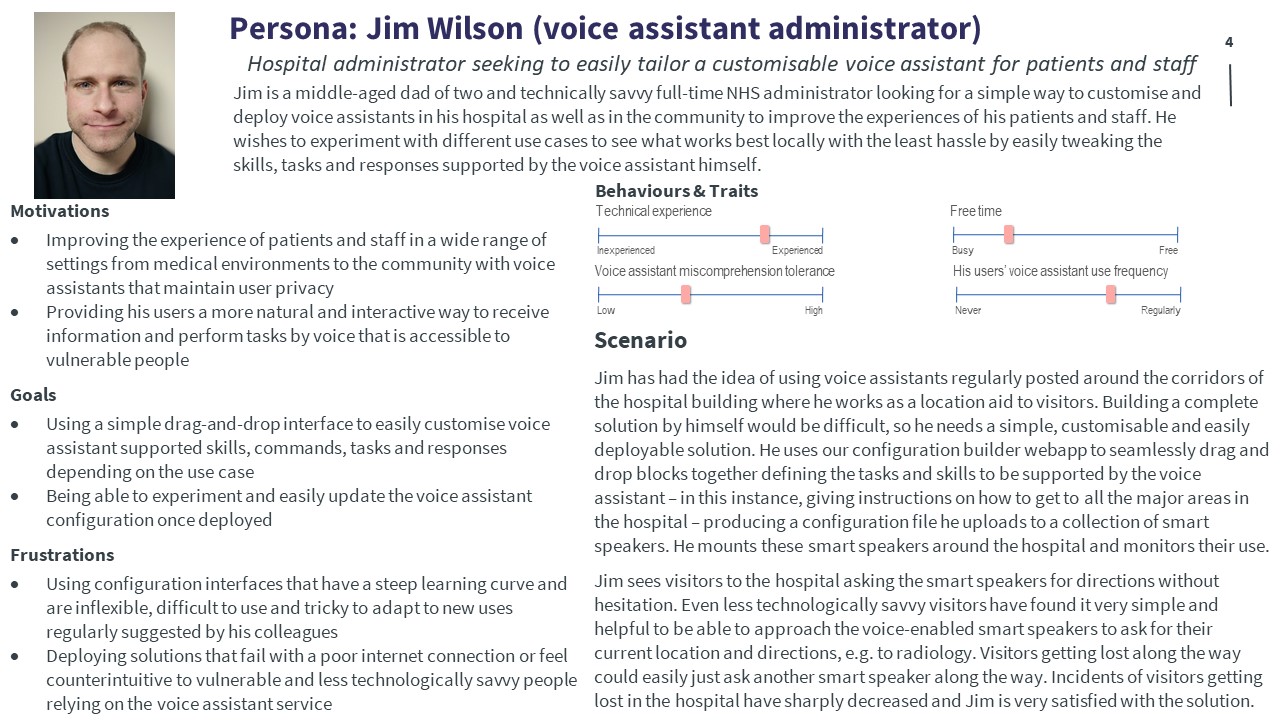
Personas & scenarios
Example: voice assistant user
Example: voice assistant administrator
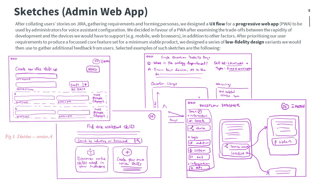
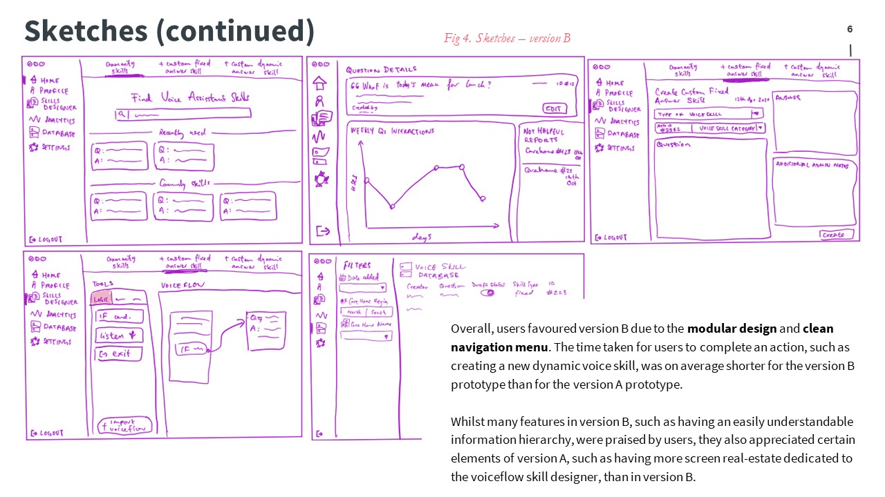
Sketches (configuration web-app)
Prototyping
Initial prototype
Taking the effective design elements from the previous sketches, we proceeded to create a higher-fidelity design and prototype in Sketch.
This visual prototype was later uploaded to Zeplin, where we used a unified commenting system to annotate over our design, commenting on usability and supported features as we conducted additional user testing.
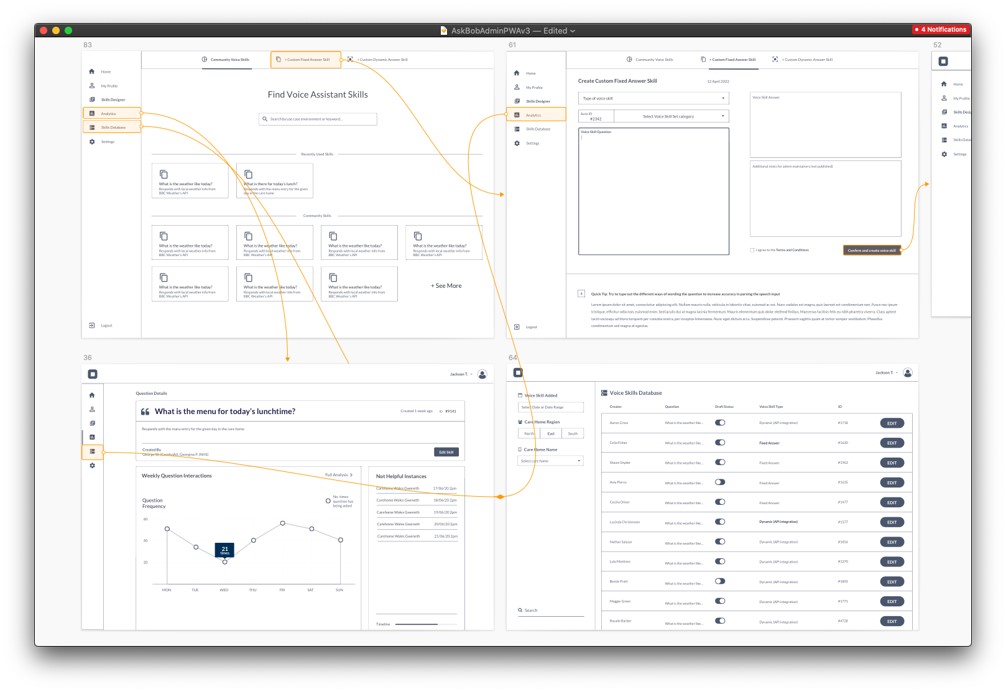
Arrows represent links between screens and orange shaded areas represent touchable areas.
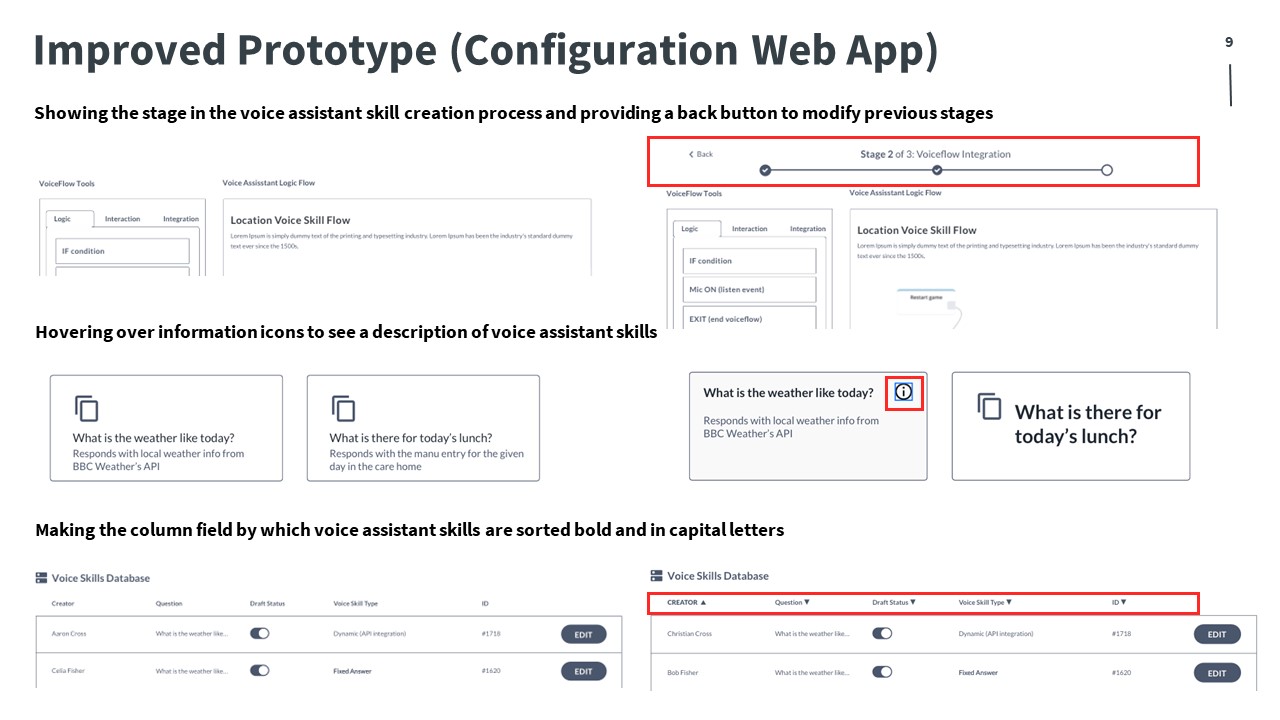
Improved prototype
We critically evaluated our initial prototype and determined improvements to the following areas:
- the visibility of the current system status
- user control and navigational freedom
- aesthetic and minimalistic design
- flexibility and ease-of-use
From this, we produced and improved prototype:
Next steps
Inspired by user-centric design, we aim to regularly reconsider how our designs can best serve the needs of all our users throughout the remainder of the AskBob engineering process.
References
- Carrol, J.M., 1999, January. Five reasons for scenario-based design. In Proceedings of the 32nd Annual Hawaii International Conference on Systems Sciences. 1999. HICSS-32. Abstracts and CD-ROM of Full Papers (pp. 11-pp). IEEE.
- Greenberg, S., Carpendale, S., Marquardt, N. and Buxton, B., 2011. Sketching user experiences: The workbook. Elsevier.
- Kuniavsky, M., 2003. Observing the user experience: a practitioner’s guide to user research. Elsevier.
- Nielsen, J. and Molich, R., 1990, March. Heuristic evaluation of user interfaces. In Proceedings of the SIGCHI conference on Human factors in computing systems (pp. 249-256).
- Norman, D.A., 1999. Affordance, conventions, and design. interactions, 6(3), pp.38-43.
- Portigal, S., 2013. Interviewing users: How to uncover compelling insights. Rosenfeld Media.
- Preece, J., Sharp, H. and Rogers, Y., 2019. Interaction Design: Beyond Human-Computer Interaction, Fifth edition. John Wiley & Sons.
